Toasts
Everyone knows what popup notifications are, but what does Toast mean? It is a small message that shows up in a box at the bottom of the screen and disappears on its own after a few seconds. It is a simple feedback about an operation in which current activity remains visible and interactive. It basically is to inform the user of something that is not critical and that does not require specific attention and does not prevent the user from using the app device.
Here I will explain how to build a notification center using Toasts with React:
To that, I'll use:
- create-react-app to set up the environment.
- React hooks.
- Context API to share functionality between all the UI components. The context will share the output of my custom hook.
- uuid to generate unique ids for the toasts.
- emotion to handle components' styles.
- react-spring to manage animations!
- tabler icons for fancy icons.
So bear with me and let's start.
npx create-react-app til-toasts
Then, we can install the rest of our dependencies:
yarn add @emotion/core @emotion/styled react-spring uuid
First, I'm going to create our custom hook in src/hooks/useToast.js to manage the toasts state. We need a toasts collection, a method to add a new toast and a method to remove a toast. Also, every toast will need a unique id, so I'm going to delegate this to our hook as well. My file looks like this:
import { useState } from 'react'
import { v1 as uuid } from 'uuid'

const useToast = () => {
  const [toasts, updateToasts] = useState([])

  const addToast = (toast) => {
    const data = {
      ...toast,
      toast: uuid(),
    }

    updateToasts([...toasts, data])
  }

  const removeToast = (toast) => {
    const filtered = toasts.filter((t) => t.toast !== toast)
    updateToasts(filtered)
  }

  return {
    toasts,
    addToast,
    removeToast,
  }
}

export default useToast
As you see, toasts is just an array of objects, where each object contains the information to render the toast component. In the addToast I augment the data object with a custom toast property to store the unique id. Then this new augmented object is inserted in the toasts collection. The removeToast function just filters the toasts returning every toast whose toast id that doesn't match with the id passed as an argument.
Sweet. I need to share that functionality across my application. We can do it with redux, mobx or similar, but I instead opted for the Context API. So in src/componentes/toastContext.js I'm going to create the context and the provider:
import React, { createContext, useContext } from 'react'

import useToast from '../hooks/useToast'
const ToastContext = createContext(null)

export const useToastContext = () => useContext(ToastContext)
export const ToastProvider = ({ children }) => {
  return <ToastContext.Provider value={useToast()}>{children}</ToastContext.Provider>
}

export default ToastContext
Some things to be noticed in this code. First, the value of our provider is the output of our useToast hook. In order to simplify the context management, I export a custom ToastProvider, hiding the complexity. I use the same approach with the context:
export const useToastContext = () => useContext(ToastContext)
This, also, has another reason. Exporting the useToastContext instead of the whole ToastContext, allow us to be able to mock this function when testing. And finally, instead of importing the useContext from react and our ToastContext as well, I only import useToastContext, so we are saving one line. Yes, I'm too lazy to write code.
Time to create our Toast component in src/components/Toast.js:
/** @jsx jsx */
import { useEffect, useCallback, useRef } from 'react'
import { jsx, css } from '@emotion/core'

import { useToastContext } from './toastContext'
import Button from './form/Button'

import { ReactComponent as X } from '../assets/x.svg'

const Toast = ({ color, title, message, toast }) => {
  const { removeToast } = useToastContext()
  const remove = useCallback(() => removeToast(toast), [removeToast, toast])

  return (
    <div
      css={css`
        border-radius: 4px;
        width: 240px;
        border-left-style: solid;
        border-left-width: 12px;
        border-left-color: ${color};
        padding: 16px;
        background-color: #fff;
        position: relative;
        box-shadow: 0 2px 12px #10248a;
      `}
    >
      <h2
        css={css`
          font-size: 14px;
          font-weight: 500;
          color: #444;
          margin-bottom: ${message ? 4 : 0}px;
        `}
      >
        {title}
      </h2>
      {message && (
        <p
          css={css`
            font-size: 12px;
            font-weight: 400;
            color: #888;
          `}
        >
          {message}
        </p>
      )}

      <Button
        onClick={remove}
        css={css`
          background: transparent;
          padding: 0;
          width: 24px;
          height: 24px;
          color: #ababab;
          position: absolute;
          top: 8px;
          right: 8px;

          svg {
            width: 16px;
            height: 16px;
          }
        `}
      >
        <X />
      </Button>
    </div>
  )
}

export default Toast
Nothing odd here, it's a functional component that consumes the context to get the removeToast function. The component uses emotion to build the styles. For now, it's enough, I will add some code later regardless of the auto-hide functionality.
Now I'm going to create the Toasting component to render every Toast in the context. In src/components/Toasting.js:
/** @jsx jsx */
import { jsx, css } from '@emotion/core'

import { useToastContext } from './toastContext'
import Toast from './Toast'

const Toasting = () => {
  const { toasts } = useToastContext()

  return (
    <ul
      css={css`
        position: fixed;
        bottom: 16px;
        right: 16px;
      `}
    >
      {toasts.map((t) => (
        <li>
          <Toast key={t.toast} {...t} />
        </li>
      ))}
    </ul>
  )
}

export default Toasting
As you see, nothing fancy in this component. I gather the toasts from the context and render a Toast component for every item in the collection. As you can see, our toasts collection only manages data for our components, so for this example, it should be nice to have a factory function to make toasts. In src/components/Toast.js add this:
export const factory = (type) => {
  const settings = {
    atom: {
      color: '#2548f5',
      title: 'Pet project',
      message: 'Time to code!',
    },
    ghost: {
      color: '#f58325',
      title: 'Terror movie',
      message: "Don't forget the popcorns!",
    },
    virus: {
      color: '#f5eb25',
      title: 'Oh no',
      message: 'Take a break, make some soup and stay safe!',
    },
    lego: {
      color: '#e425f5',
      title: 'Parenting',
      message: 'Time to play!',
    },
    heart: {
      color: '#f52537',
      title: 'Overcoming COVID-19',
      message: 'Distant but together!',
    },
  }

  return settings[type]
}
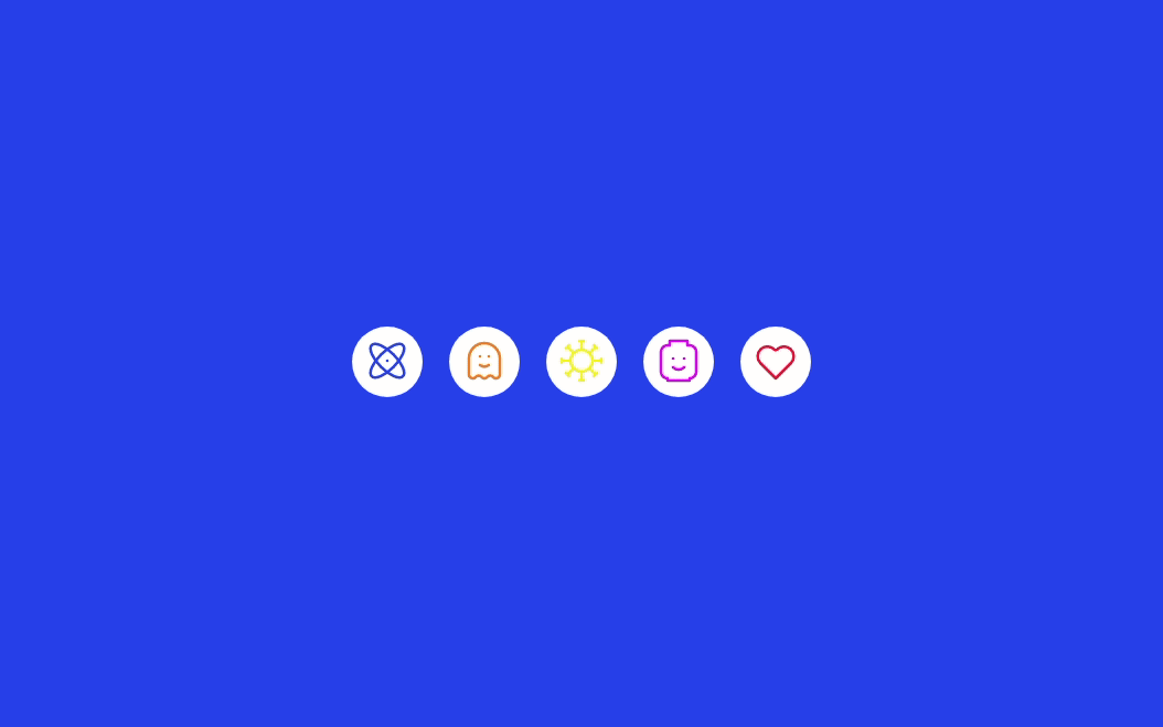
This factory function just receives a type parameter and return some boilerplate object, this will be enough for this example. Now, I'm going to create a component to generate toasts on demand. In src/components/Card.js add this code:
/** @jsx jsx */
import { jsx, css } from '@emotion/core'
import styled from '@emotion/styled'

import { useToastContext } from './toastContext'
import Button from './form/Button'
import { factory } from './Toast'

import { ReactComponent as Atom } from '../assets/atom.svg'
import { ReactComponent as Ghost } from '../assets/ghost.svg'
import { ReactComponent as Virus } from '../assets/virus.svg'
import { ReactComponent as Lego } from '../assets/lego.svg'
import { ReactComponent as Heart } from '../assets/heart.svg'

const Action = styled(Button)`
  width: 64px;
  height: 64px;
  border-radius: 50%;
  padding: 0;

  svg {
    width: 48px;
    height: 48px;
    stroke-width: 1.25;
  }
`

const Card = () => {
  const { addToast } = useToastContext()

  return (
    <ul
      css={css`
        display: flex;

        li + li {
          margin-left: 24px;
        }
      `}
    >
      <li>
        <Action
          css={css`
            color: #2548f5;
          `}
          onClick={() => addToast(factory('atom'))}
        >
          <Atom />
        </Action>
      </li>

      <li>
        <Action
          css={css`
            color: #f58325;
          `}
          onClick={() => addToast(factory('ghost'))}
        >
          <Ghost />
        </Action>
      </li>

      <li>
        <Action
          css={css`
            color: #f5eb25;
          `}
          onClick={() => addToast(factory('virus'))}
        >
          <Virus />
        </Action>
      </li>

      <li>
        <Action
          css={css`
            color: #e425f5;
          `}
          onClick={() => addToast(factory('lego'))}
        >
          <Lego />
        </Action>
      </li>

      <li>
        <Action
          css={css`
            color: #f52537;
          `}
          onClick={() => addToast(factory('heart'))}
        >
          <Heart />
        </Action>
      </li>
    </ul>
  )
}

export default Card
I'm using the svg icons we got from tabler icons, imported as React components. Because I need to create a toast every time a user clicks on a button, I import the addToast from the context, and the factory function we created to ease the development at this point. To finish our mvp, let's glue all the pieces in our src/App.js:
/** @jsx jsx */
import { Global, jsx, css } from '@emotion/core'

import { reset } from './util/reset'
import { ToastProvider } from './components/toastContext'
import Card from './components/Card'
import Toasting from './components/Toasting'

const App = () => (
  <ToastProvider>
    <Global styles={reset} />
    <section
      css={css`
        height: 100vh;
        background-color: #2548f5;
        color: #fff;
        display: flex;
        justify-content: center;
        align-items: center;
      `}
    >
      <Card />
    </section>

    <Toasting />
  </ToastProvider>
)

export default App
As you see, I use the ToastProvider, Card and Toasting components. Also, the file includes some styles reset utility. At this point, I have a more or less working toasting center, but some points are missing, that from the UX experience can make a difference:
- Animations
- Auto-hide
To add animations, I'm going to include react-spring in our Toasting component. Because I have a collection of elements, it makes sense that I use useTransition to animate the changes in the collection. I'm going to make a fade in and fade out transition, but to smooth the entering and leaving effect, a height transition should be nice as well. The "problem" in this case is how to animate a Toast component from 0 to auto and backward. To fix this, I'm going to use a ref to calculate the node's clientHeight. To track every toast's ref, I'm going to use a Map object, clearing the reference when the component leaves the DOM. So the Toasting component in src/components/Toasting.js looks like this after adding the new code:
/** @jsx jsx */
import { useState } from 'react'
import { jsx, css } from '@emotion/core'
import { useTransition, animated } from 'react-spring'

import { useToastContext } from './toastContext'
import Toast from './Toast'

const Toasting = () => {
  const { toasts } = useToastContext()
  const [refMap] = useState(() => new Map())

  const transitions = useTransition(toasts, (toast) => toast.toast, {
    enter: (item) => async (next) => {
      await next({
        opacity: 1,
        height: refMap.get(item.toast).clientHeight + 16,
      })
    },
    leave: (item) => async (next) => {
      refMap.delete(item.toast)
      await next({ opacity: 0, height: 0 })
    },
    from: { opacity: 0, height: 0 },
  })

  return (
    <div
      css={css`
        position: fixed;
        bottom: 16px;
        right: 16px;
      `}
    >
      <ul>
        {transitions.map(({ item, props, key }) => (
          <animated.li key={key} style={props}>
            <div ref={(ref) => ref && refMap.set(item.toast, ref)}>
              <Toast key={item.toast} {...item} />
            </div>
          </animated.li>
        ))}
      </ul>
    </div>
  )
}

export default Toasting
As you can see, I use the unique toast id as the transition key. One thing to notice is that I'm not animating the Toast component but a li element used as a container. This allows me to calculate the clientHeight of the Toast to be able to animate the height.
To add the auto-hide effect, I'm going to add a setTimeout in src/components/Toast.js that will hide the toast after 5 seconds:
useEffect(() => {
  const TTL = 5 * 1000
  const timeout = setTimeout(remove, TTL)

  return () => {
    clearTimeout(timeout)
  }
}, [remove])
I'm using the useEffect hook to call the setTimeout, and every time the component is unmounted, I clear the timeout. If you try the app now, you can see there is an issue with this. If you throw a toast and after 2 seconds, throw another, you will see the timeout is rebuilt again, so instead of 5 seconds, we definitely have to wait longer to see the first toast disappear. This is because every time a new toast is created the component is rerendered, so the interval starts again. To fix this, I need to calculate how long the component has been rendered, so in the next render, the interval responds to the time left. To keep a variable between renders, I need to use useRef hook, so our code looks like this:
const eta = useRef(TTL)

useEffect(() => {
  const timeout = setTimeout(remove, eta.current)
  const created = new Date()

  return () => {
    const now = new Date()
    eta.current = eta.current - (now - created)
    clearTimeout(timeout)
  }
}, [remove, toast])
If you try the app, the auto-hide thing works better now. And with that, I completed the toast notification center. Obviously, in a real application, the toast generation will respond to events coming from an eventual API or user actions, but I hope this example will help you to orchestrate more complex scenarios.
As always, you can grab the complete code from this repo.